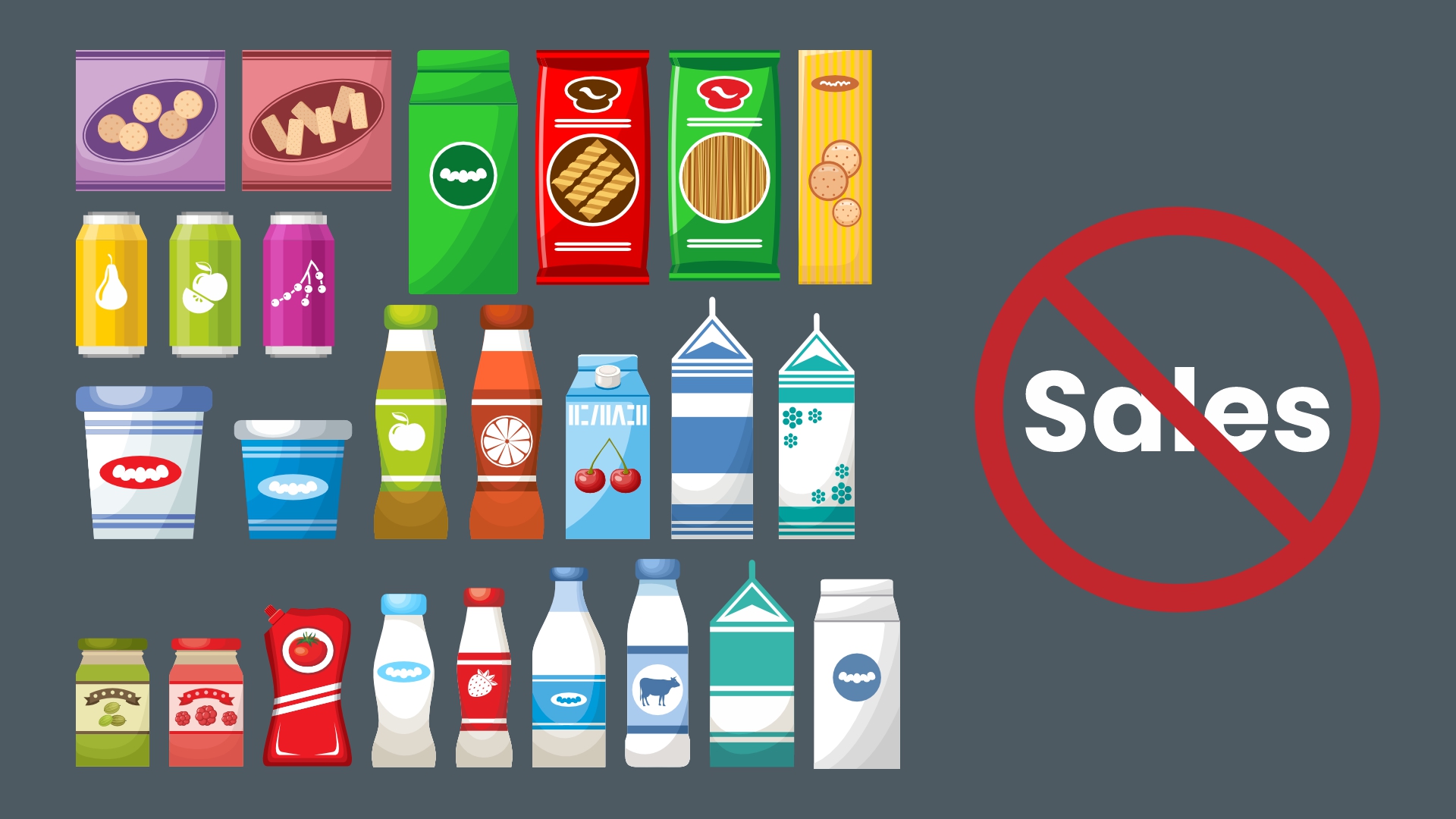
If you’ve ever stood in a supermarket aisle staring at endless rows of products, you already know this truth: people don’t buy the “best” product. They buy whatever catches their eye, feels trustworthy and solves their problem without making them think too much. This is exactly where packaging can either act like your top-performing salesperson or become the silent reason sales stay stuck.
A few months ago, we were working with a small business owner who sold handcrafted organic soaps. Her products were great, reviews were genuinely positive, and she was active on social media. Yet the sales inside retail stores were painfully slow. When we finally saw her packaging, everything clicked. The soap smelled heavenly, but the packaging looked more like something from a dusty warehouse shelf. The label was crowded, the colours were dull, and the product description was lost between random icons.
We concluded, she didn’t need better marketing; she needed clarity.
Brands don’t fail in the market. They fail on the shelf long before a customer even picks them up.
So let’s break down the packaging design mistakes that quietly kill sales, many of which even established brands overlook.
A pretty pack that communicates nothing is one of the biggest sales killers.
Customers hardly have a few seconds on hand to understand what your product is. If they have to tilt the box, rotate it, squint at tiny text or decode clever phrases, you’ve already lost them. Good packaging doesn’t play hide and seek. It simply states the essentials:
• What the product is
• Who it’s for
• Why it matters
If these three things aren’t obvious at first glance, people put the product back; as clarity always wins over creativity.
This happens more often than you’d think. Brands feel the urge to add “just one more” color, icon, benefit, tagline, stamp or certification. Before they know it, the packaging ends up looking like a promotional pamphlet. Customers don’t have time to process chaos. Their eyes skip over busy designs because clutter makes decision-making harder.
Simple design is not “boring.” It’s powerful. It’s confident. It tells the customer: “We know what we’re selling. You’ll know it too.”
Visual hierarchy is a fancy way of saying “where the eyes should go first.”
If everything on the packaging shouts for attention such as the logo, the product name, the ingredients, benefits, offers; then nothing actually gets noticed.
A customer should know in this order:
Switch that order and watch confusion take over.
Sometimes the sale doesn’t happen because the customer couldn’t find the essential information quickly enough to grab the item.
Packaging that tries to appeal to everyone ends up appealing to no one. A kids’ product needs a different vibe from a premium skincare brand. A budget-friendly snack shouldn’t look like a luxury chocolate bar.
When packaging doesn’t emotionally match the audience, it creates a disconnect. And when customers don’t feel understood, they move on. People buy with feelings first, logic later. Good packaging speaks the language and understands the vibe of its audience without even saying a word.
Customers may not always analyze packaging material consciously, but they do feel it. They feel it in the weight of the box, the texture of the label, the crispness of the print.
Flimsy materials make the product feel “cheap.” Meanwhile, solid materials make it feel “premium.” And they notice the difference immediately. In many cases, customers are willing to pay purely because the packaging feels trustworthy.
Nothing kills brand love faster than packaging that refuses to cooperate. If customers need scissors, knives, teeth or patience to open your product, they’re already annoyed. Frustration becomes a part of the brand experience, and that memory stays.
User-friendly packaging is not optional anymore. It’s an expectation.
Here’s a secret: customers don’t buy products. They buy solutions.
A moisturizer is not “hydrating.” It “keeps skin soft all day.”
A protein bar is not “high in nutrients.” It “keeps you full between meals.”
When packaging talks in features instead of outcomes, it loses its persuasive power. Customers want to know: “What will this do for me?” If your packaging doesn’t answer that question clearly, sales slow down.
Sometimes brands blend in so well that they disappear. While it may feel safe to follow industry trends, it’s dangerous for visibility. If your product looks like the rest, the customer has no reason to choose yours.
Differentiation is the oxygen of retail shelves.
If your social media feels friendly, your website feels corporate and your packaging feels outdated, the customer won’t know what to believe. Inconsistency lowers trust, and trust directly affects sales. Packaging should match your brand personality everywhere else.
When everything feels aligned, customers feel more confident buying.
In 2025, packaging doesn’t just live on shelves; it lives on screens. If your product looks reflective, low contrast or dull when photographed, your online conversions take a hit.
People shop with their eyes, especially online. If it doesn’t look good in a thumbnail, they keep scrolling.
We, Asense Branding, a branding agency based in Rajkot, once came across an interesting packaging case. A snack brand once approached an agency with a simple complaint: “People love our product, but sales aren’t moving.” The moment their packaging was looked at, things started to make sense. It felt old-school, cluttered, and every element was fighting to be in the spotlight.
They reworked the hierarchy, simplified the design and brought out the core benefit clearly: “Guilt-free snacking you can trust.”
Within three months, their in-store sales rose significantly. Not because the product was changed, but because it was easier for customers to choose it.
If you want someone to review your packaging with fresh eyes, we’d be happy to help, because sometimes the smallest tweaks create the biggest shifts.