Packaging quickly becomes more than just a protective cover today in the competitive food market; it becomes the brand's first interaction with the customer. Packaging has already made a statement, created an expectation and won or lost a sale before the first bite is taken. Food brands that pay attention to thoughtful, eye-catching packaging outperform those that do not. With shelves full and e-commerce feeds scrolling, it is clear that packaging is a key differentiator that can help food brands stand out.
For inspiration on the best food packaging ideas to capture buyers, check out the curated Pinterest board of [Asense brand's Pinterestboard](https://in.pinterest.com/Asensebranding/_created) — a favorite place to discover food packaging inspiration.
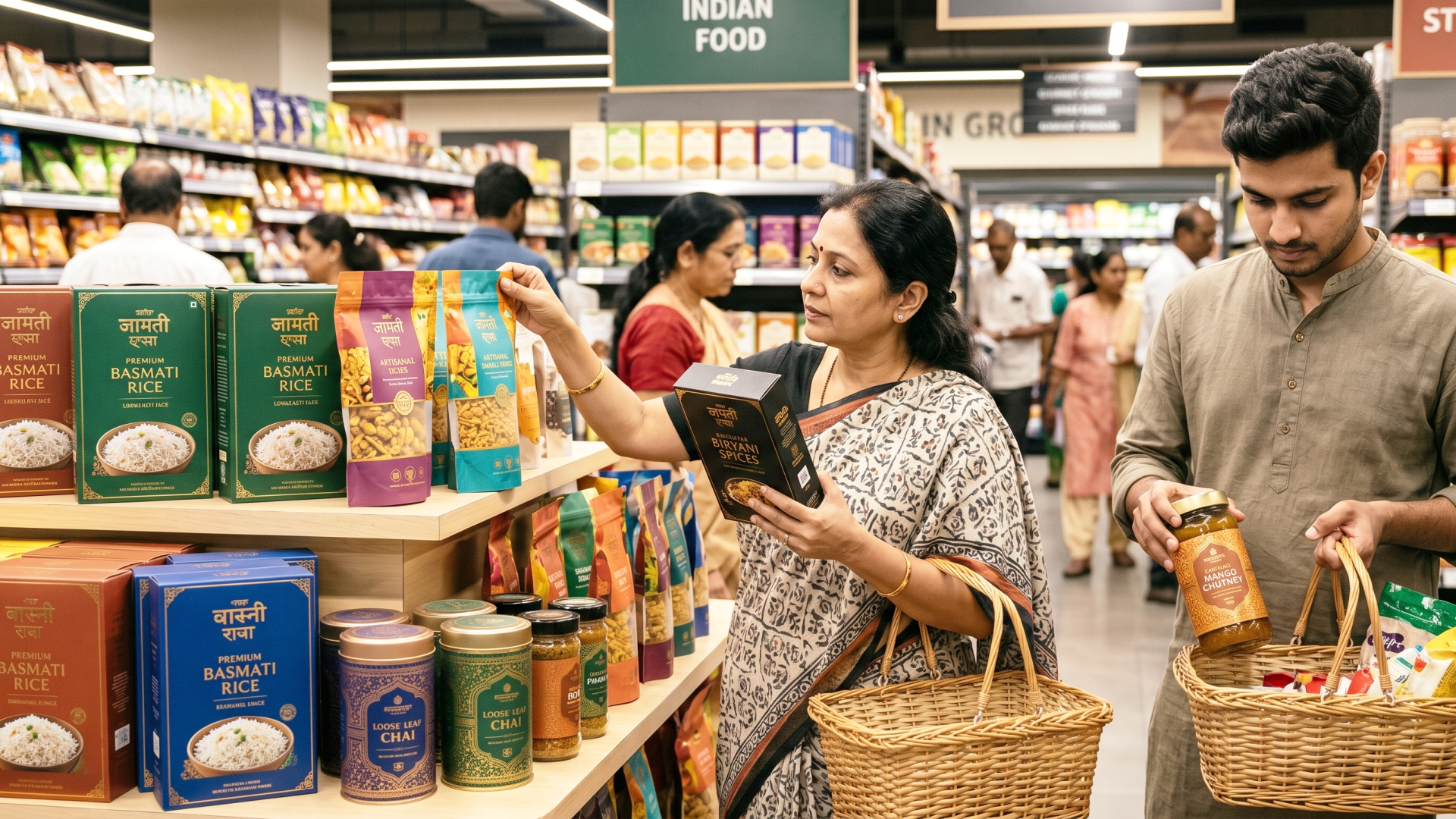
Create a message in your Label Design
The most magnetic packaging doesn't just tell what's inside, it tells the reason for the product. A craft granola company, for example, could convey freshness and authenticity through illustrations of a farmer's field that are hand-drawn. A high-quality olive oil may be more likely to adopt old-world style to convey tradition and quality.
Storytelling packaging works because it makes an emotional connection before the product is opened. It's not only about food anymore, it's about feeling. Brands on [Asense Branding's Pinterest](https://in.pinterest.com/Asensebranding/_created/) show how even a simple label can be a canvas for a brand story, with colour choices, styles of illustrations, and typography working together to tell a brand story.
The principle: Each design aspect – font, colour, texture, illustration – should all be aligned to a unified message regarding your brand's values.
The future will be defined by color.4. There is a new packaging trend for everything.
There has never been a more luxurious life. Uncluttered, clean packaging with ample white space, one hero image, and limited text predominate in the premium food category. Consider artisanal chocolates, cold-pressed juices, and specialty coffees.
Minimalist packaging conveys confidence, the product doesn't need to shout because it knows it's good. It also snaps a great photo, a feature no other camera can boast, especially in the era of Instagram and Pinterest sharing.
Look through our Pinterest board [AsenseBranding](https://in.pinterest.com/Asensebranding/) and you'll see how, when done with purpose, minimalism gives a modern and timeless feel to packaging. It's not slack – every part that still exists has earned a place.
The takeaway: Simplify your design. If it isn't enhancing your brand message and/or clarity, get rid of it
Demonstrate your packaging design through sustainable projects.Use sustainable projects as a visual statement for packaging design.
Eco-friendly packaging is not just about ticking boxes – it is a key visual identifier. The use of kraft paper, seed paper labels, compostable mailers and glass jars with minimal ink printing are speaking directly to those who value the environment, and actively look for brands that reflect that.
However, green packaging that is also visually appealing is key. Honest, earthy colour tones of recycled materials convey authenticity. A too slick or man-made package might actually do more harm than help the message. Packaging's textural, tactile and aesthetic qualities should amplify the sustainability message.
Many of the brands listed on [Asense Branding's Pinterest board](https://in.pinterest.com/Asensebranding/_created/) often show that there is no need to compromise on visual appeal when making a product more eco-friendly — in fact, using natural fabrics and neutral colours can make a product feel more premium.
Takeaway: Use sustainable materials and let them do the talking. Ensure that the visual design language conveys the values that your packaging physically represents.
Colour is the first thing that the human eye sees — before shape and text. When food brands grasp the significance of colour psychology, they have a tremendous tool at their disposal. Red and orange are stimulating food and urgency (fast food!) and green represents health and freshness. The deep navy and gold tones are indicative of quality, and pastel shades are for the gentleness and the artisanal touch.
The best packaging is the one that is not just pretty, but also purposeful in its colour selection. A children's snack company may be vibrant and playful. Clean clinical whites and greens could be a functional health supplement choice. A fancy dessert line could embrace alluring jewel hues.
Just a few things to learn from the [Asense Branding Pinterest gallery](https://in.pinterest.com/Asensebranding/_created/): how colour combinations evoke instant shelf recognition and emotional impact, and just how much value there is in studying them before a new packaging project.
Takeaway: Select a color scheme that evokes the emotions you wish to convey to your target customer, not only what you think looks good on its own.
Half the battle is visual design. Packaging not only offers a visual appeal but also a tactile one, with elements such as texture, weight, and opening mechanisms contributing to the overall experience. Matte finishes are soft touch and premium. Tactile logos are embossed for distinction. The well-thought-out re-seal closure conveys thoughtfulness and functionality.
Structural packaging is even more important for gifting occasions. A food product packaged in rigid boxes with magnetic lids, tissue boxes with an interior, and custom-printed sleeves adds delight to the gift experience, leaving a customer with a fond memory — and photo — to take with them.
As far as structural packaging innovation goes, there's a lot of information available on [Asense Branding's Pinterest](https://in.pinterest.com/Asensebranding/_created/).
Takeaway: Focus on more than just the labels. The feeling of handling, opening and keeping your packaging is part of your brand experience.
When a design is not to be illustrated or photographed, then a strong and expressive type can become the whole visual element of a package. A stock photo may be cute and visually appealing, but a package that is uniquely designed with custom typefaces, hand-lettered logos and artful typography will feel artisanal and one-of-a-kind, too.
For brands with a personality, typography-driven packaging can be very effective – for example, if your food brand has a humorous, conversational tone, you can use oversized display letters that echo that tone. Classic serif faces to suggest decades of trust can be employed by a heritage brand.
Look at the packaging examples on the Asense Branding Pinterest board and you'll see how many times a great packaging design is really a typographic piece in which fonts are as carefully selected as ingredients.
Takeaway: Invest in custom typography or typography that is of a higher quality. If a system font is used, the generic name appears in the font.The generic name is used for system fonts.
There's a growing consumer desire to see what they're buying. Clear windows in packages, whether by die-cut shapes, clear panels or full transparency on packages, establish trust right away. It indicates that it has no reason to be embarrassed about the way the product looks and is so proud of it.
It is particularly effective for products that are inherently appealing to the eye, such as pasta, granola, spices, dried fruits and artisan bread. This product is incorporated into the design.
Asense Branding has been curating on Pinterest and found some great examples of how to make packaging feel refreshingly honest in a marketing sceptical world, even within its structural and label design.
Significant point: The product should look nice; show it. Transparency helps foster trust and alleviate purchase concerns.
Seasonal or limited-edition packaging is one of the best strategies to create a sense of urgency and re-purchase. These special releases foster collectability and excitement, especially during festivals, harvest periods, or cultural events. They also create social media posts – customers post limited editions due to their limited value.
For seasonal packaging it is not necessary to completely redesign. It is often just a slight change to your basic packaging, but with the addition of a seasonal colour scheme, a particular illustrative element or a festive message. The brand is still recognizable and the limited-edition cues make them newsworthy.
Take home message: Incorporate seasonal packaging into your annual brand calendar. Small changes can make a big difference on seasonal sales.
Every rupee spent on exceptional food packaging design pays off throughout the customer journey – from the first time they spot your product on the shelf, through the unboxing experience, to social sharing and back again to the next time they consider buying. The brands that are doing well with packaging are the ones who are making it a part of the brand and not the end product.
Whether you're in the artwork department or the packaging department, follow Asense Branding on Pinterest for continuous inspiration on packaging in all areas from artisan snack design to high quality beverage packaging. Their curated board is a great resource for brand managers, designers and founders to keep up-to-date on packaging design trends.
Good packaging does more than just catch the attention of customers. It makes them advocates.
Want to re-imagine your food brand packaging? Learn about the successes of others within each category, then create a brief that prioritizes your brand narrative, target customer psychology, and your product's physical attributes in every design.