Every year, design juries around the world look at thousands of entries. Most are good, some are excellent and then there are the rare ones that make judges pause for a moment. Those are the designs that go home with trophies. As we head into 2026, logo and packaging design is becoming less about decoration and more about meaning, usability, sustainability, and emotional truth. If we loo at it like this, clients want results, consumers want honesty and the juries want intention. Well, this way the designers are right in the middle of it all, turning ideas into visual stories.
So what kind of work is going to win awards in 2026? They’ll not be the loudest designs neither will they be the most complicated ones. The ones that will shine are the ones that feel alive, necessary, and human.
Let’s break it down.
Award juries are tired of visuals that look pretty but say nothing. In 2026, the strongest logo systems will be built from a clear purpose. A logo may still be minimal or expressive, geometric or hand drawn, but it will always connect deeply to the brand’s story.
Designers are finally moving past forced symbolism. Instead, they are building visual systems that grow naturally from the brand’s values and culture. They think timeless over trendy, flexible over fixed, and living systems rather than static marks.
If a jury can look at a logo and immediately understand why it looks the way it does, you are already halfway to the shortlist.
In the past, logos were expected to stay the same forever. Now they are expected to move, respond, breathe a little. In 2026, logo systems that adapt across platforms will dominate award shows. Variable marks and motion-ready identities; responsive systems that shrink, expand, change color, or evolve contextually. The key is not gimmick. It is purpose.
If a logo grows or shifts for a reason, juries will notice. If it moves only to look fancy, they will notice that too.
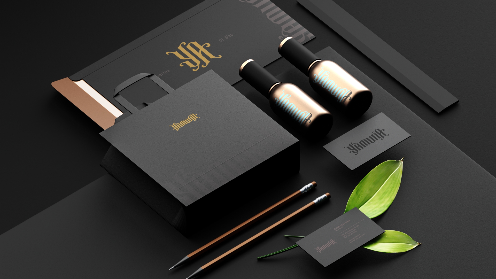
Super polished, glossy design is slowly fading from the spotlight. People are drawn to packaging that feels closer to real life. Simple typography, real textures, unfiltered photography, adopting natural color palettes and labels that look like someone actually cared to write them.
In 2026, packaging that tells the truth will win awards. Design that respects the product inside instead of overshadowing it, one that is warm enough to touch and feels like a conversation rather than a performance. The human touch is back. And it is staying.
Minimalism never fully left. It just changed shape. The new simplicity is quiet but layered. A clean layout with one unexpected detail, a minimal color palette with emotional tone, or a simple logo with a strong idea behind it. The trick is restraint; basicaly its knowing when to stop.
Award winners in 2026 will show courage in editing. They will remove everything that is not needed and leave behind only the heart of the story. It sounds easy, however it almost never is.
This is huge. Juries are increasingly critical about sustainability claims. Recycled-looking graphics are not enough anymore. Designers who go the extra step to rethink materials, reduce layers, simplify printing processes, and design for reuse will stand out. Sustainability will not be a visual style. It will be a design ethic.
Smart material choices, honest transparency and packaging that respects the planet rather than pretending to. When the work improves both the brand and the environment, the juries lean forward.
2026 belongs to designers who know that typography is not just letters. It is voice, it is personality, and it is emotion. Custom lettering, expressive serif revivals, cultural influences, handcrafted strokes, tiny imperfections that make a mark feel human. These things matter.
Great design in 2026 will not scream. It will feel. Logos and packaging that make people smile a little, pause, remember, trust. Those are the ones juries fall in love with.
There is a rising respect for authenticity. Brands rooted in culture are embracing their real history instead of polishing it into something generic. Local scripts, traditional motifs, region-inspired color palettes and real stories rather than borrowed ones.
But there is a line. Cultural identity must be handled with care, credit, and involvement. When it is done right, it feels soulful. When it is done lazily, it feels hollow. And the Award juries know the difference.
Static work is losing ground. Designers who think in motion are shaping the future. Logos that animate. Packaging with AR layers. Identity systems that come alive in digital spaces. The rule is simple. Motion should add meaning, not distraction.
In 2026, juries will reward brands that come alive naturally across platforms. Not through special effects but through thoughtful movement that reveals personality.
Ergonomics is entering the award space in a serious way. Packaging that opens easily, bottles that fit naturally in the hand and boxes that children and seniors can use without struggle. User experience will matter as much as aesthetics. This shift is beautiful because it reminds everyone that packaging design is for people, not for portfolios.
There was a time when the loudest design took home the trophy. That time is fading. 2026 will reward confidence, simplicity and the work that knows what it is and does not try to shout for attention. Designers are stepping away from performative cleverness and toward genuine clarity. And clarity wins.
Not just beauty. Not just trendiness. What wins is intention.
Design that respects the planet. Design that respects people. Design that carries meaning in every line and every fold. Design that feels like it belongs in the world and not only in a judging room.
If your logo or packaging can do three things, your chances rise sharply:
• Tell the truth
• Serve the user
• Hold emotional weight
Do that with craft. Do it without ego. And your work will not only win trophies. It will matter.
If thoughtful, purposeful design speaks to you, stay connected with us, Asense Branding, a branding agency based in Rajkot. And whenever you feel ready to shape a logo or packaging idea that truly stands out, just reach out. Sometimes big wins begin with a simple conversation.